ShopDreamUp AI ArtDreamUp
Deviation Actions


Suggested Deviants


Suggested Collections


You Might Like…


Featured in Groups


Description
Hi everyone, I m kind of back!
Sorry for the very few submissons lately. I ve just been way too busy!
I hope you ll enjoy this though! I m a bit out of excercise....
PS : Sorry just made a small edit to the previous drawing!
Sorry for the very few submissons lately. I ve just been way too busy!
I hope you ll enjoy this though! I m a bit out of excercise....
PS : Sorry just made a small edit to the previous drawing!
Image size
2588x2743px 5.73 MB
© 2011 - 2024 Sword-of-Orion-Mirii
Comments20
Join the community to add your comment. Already a deviant? Log In
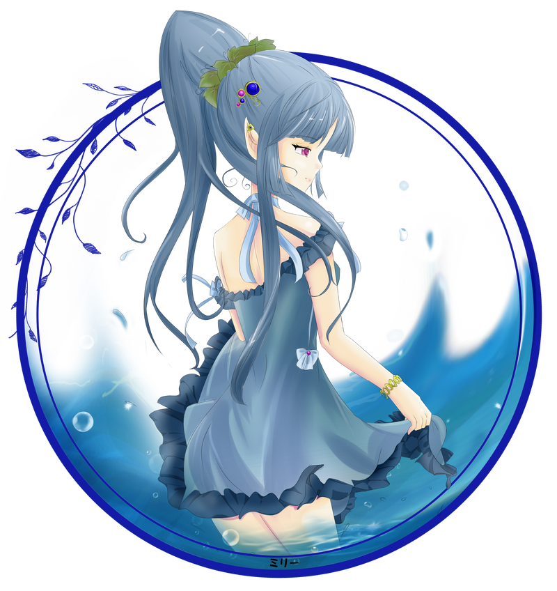
You know, I'm not normally a fan of anime, but while I was surfing through all of the critiqueable artworks, the composition of this one stood out even as a thumbnail.
There are many ways in which this is striking.
For starters, when you first look at it, the whole thing has a very harmonious, balanced look in the way you've framed it, which fits the calm mood of the character. A nice, subtle touch is the blue algae leaves growing around the frame--just enough to lend some extra interest without being overdone and ruining the effect you were going for, of making sure it's not overly-cluttered.
Another interesting touch is the way you've managed to incorporate smooth curves (the frame, the flow of the dress, most of the waves) and sharp angles (the point of the ear and of the hair--which normally isn't natural-looking but works here, and a few of the waves) into a harmonious composition.
The colors go a long way to pull it all together, too; while the blues and pinks appear to be contrasting against each other, it appears as though you've incorporated a little bit of "blue" into those hues too, and the gold of the bracelet even seems to be toned down to reflect the blue around it, too. Nor is the red of the eyes fire-engine red; they stand out but fit with your chosen palette as well.
The only thing I might recommend would be to work a little bit on the technique you use on the water; while I think you might have been going for sea spray, the water doesn't really look convincingly solid where the waves break the surface, and I also don't think you'd see bubbles like that, on or above the surface; sea spray usually doesn't look like that. Bubbles like that one would expect below the surface, and if one is floating on the surface it should be a "dome" of sorts being held together by surface tension.
However, the water looks great where she's standing in the water and the water passes over her legs.
Overall, very nice!